ACTION DESIGN NETWORK
Action Design Network is a non-profit organization that promotes the use of behavioral sciences in policy making and product design. They have a community of 15 chapters across 3 different continents, boasting 10,000 members worldwide. In-person meetups are the bread and butter of Action Design Network, with their main value being found in the networking and connections made at these meetings.
Overview
Action Design Network was in need of a website refresh. Their site was originally scrambled together in a quick push to create an internet presence, but was not given much thought after that. Most actions taken on the site actually redirect users to other sites. If a user clicks on a city, a podcast recording or wants to visit the job board they are taken offsite to the respective third party. Our stakeholders came to us asking for help improving the overall navigation and discoverability while also providing a foundation for their future growth. Covid-19 had just begun shutting things down across the US as this project began which presented us with some unique opportunities to explore. Considering that in-person meetups are the life-blood of Action Design Network, this would be something that needed to shift.
Getting to Know the Landscape
Our team started out performing what we called a “Landscape Analysis.” This is essentially a competitive analysis, but as we did our research we learned that this non-profit sector was not necessarily a competitive space, but more of a symbiotic partnership with each organization carrying a different load to help support each other. We felt we needed to take a look at these partners to discover what was being done well and what users valued in other organizations to potentially carry over into our designs.
We uncovered that each of these organizations emphasized a strong sense of community, but like Action Design Network, commonly outsourced communication with users to third party sites like LinkedIn or Facebook. We took note of the way each structured their websites (with particular focus on their homepage) and found that while some did a good job of condensing all their information and conveying their mission in a clear manner, others seemed haphazard and disjointed.
Understanding Our Audience
Knowing that our stakeholders were looking to restructure the site, we turned to users to learn what their likes and dislikes with the current site were and what, if any, changes they would want to see. We needed to know what value current Action Design Network members were getting out of the site. We also talked to a few new users who had never visited the Action Design Network website before to get a feel for what people’s first impressions of the site were and what areas could be improved to facilitate understandability.
Here, we ran into a bit of a road bump. We found that we were given users to speak to on two ends of a spectrum. Users were either heavily involved members of the organization that worked very closely with our stakeholders or were people that had no involvement whatsoever with Action Design Network or even the behavioral sciences field. Due to time constraints our team was forced to create some assumptions for users falling between new and experienced.
After performing an affinity diagram we were able to identify some groupings that we believed would be the main drivers when moving forward in our design process:
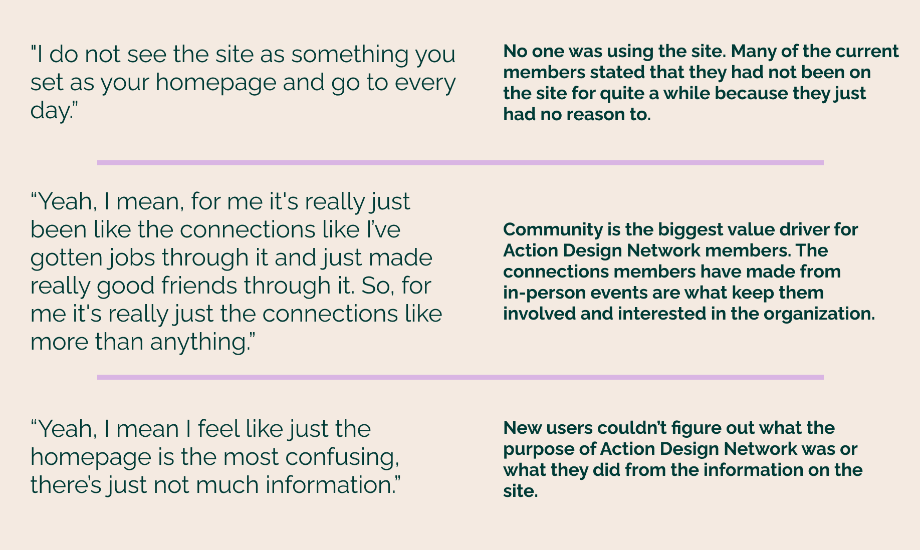
We took this information to our stakeholders to make sure we were aligned on the main areas we wanted to move forward with. Our clients were very receptive to the findings presented to them and agreed with the assumptions we made for users that fell between brand new and experienced. They were in fact unsure if any that used the site regularly even existed.
Defining the Problem
Personas
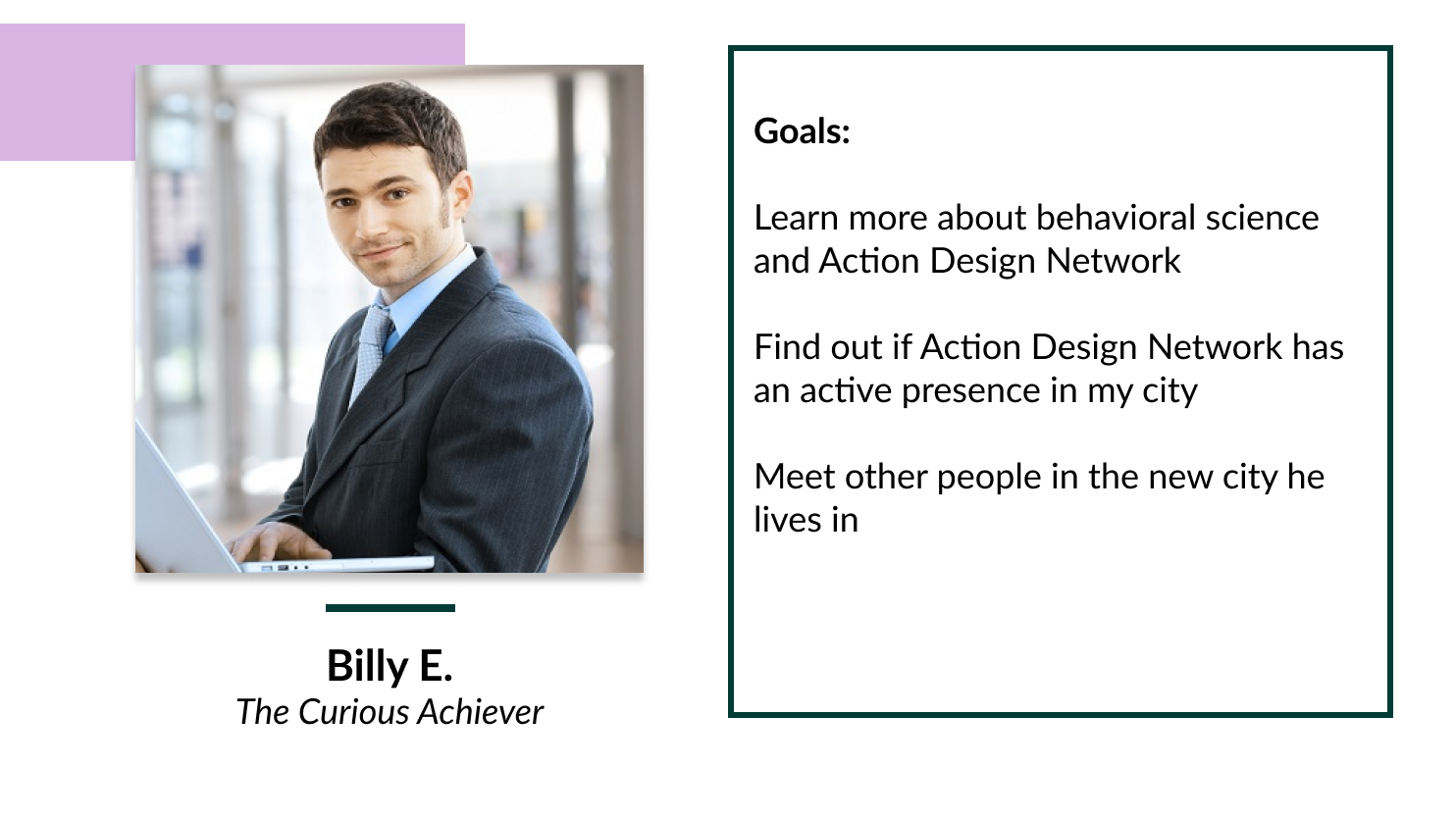
After talking to our stakeholders as well as other experienced Action Design Network members we felt confident in breaking our users into two different persona groups; Billy and Tina. Billy represented the new users whose main goals were to find out what Action Design Network is about and how they can get involved. Tina represented their more established members. Tina’s goals included wanting to engage with the organization even when she couldn’t make the in-person meetups and finding ways to apply behavioral sciences to her daily life.

Problem Statements
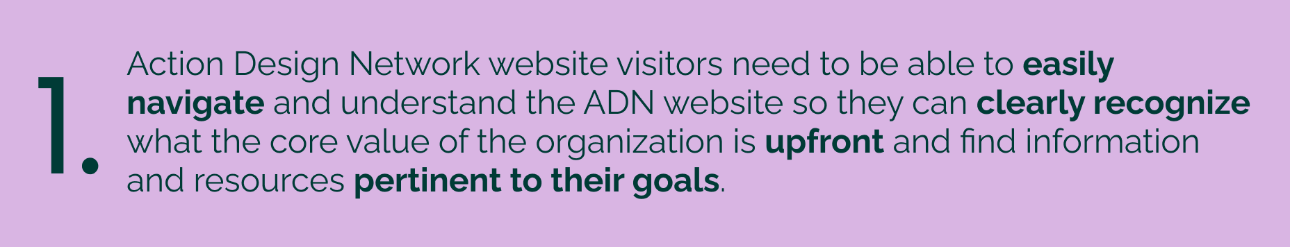
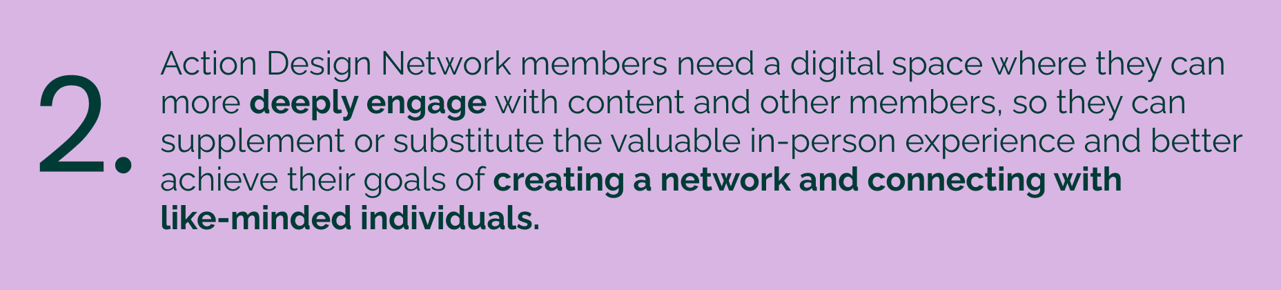
Once we had uncovered the biggest areas of concern we knew we needed to focus these into specific problems to solve for. Our team consistently revisited these statements when making design decisions to make sure we were solving for what our users told us they needed. Problem statement #1 focused on the initial ask of restructuring to improve discoverability and navigability. Problem statement #2 addressed the information gathered during user interviews that users were looking for ways to connect and engage outside of the in-person meetings.
Exploring Our Options
After clearly defining our problem space, the team moved on to ideating how we could address these problems. We each took time individually to sketch and brain dump initial ideas to restructure the home page as well as finding ways to add value to the site and giving users a reason to engage.
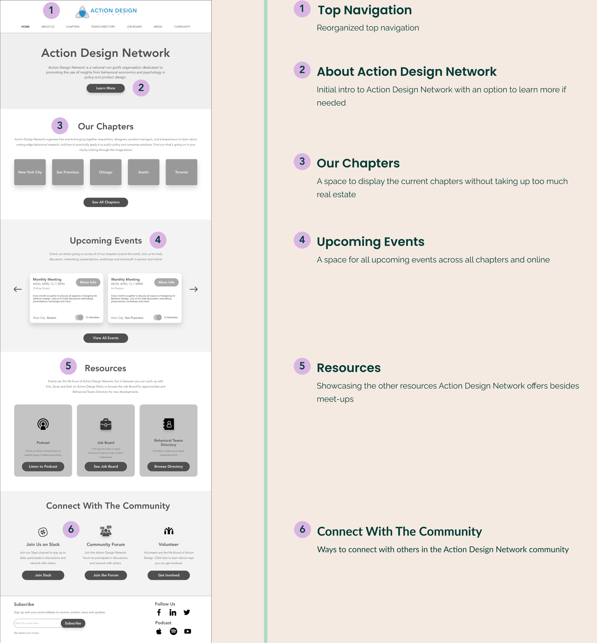
Home page
Our team broke down a number of different layouts for the home page. We knew from our initial stakeholder conversation as well as from talking to users that this page needed to provide more information about the organization as well as give a snapshot of everything it offered.
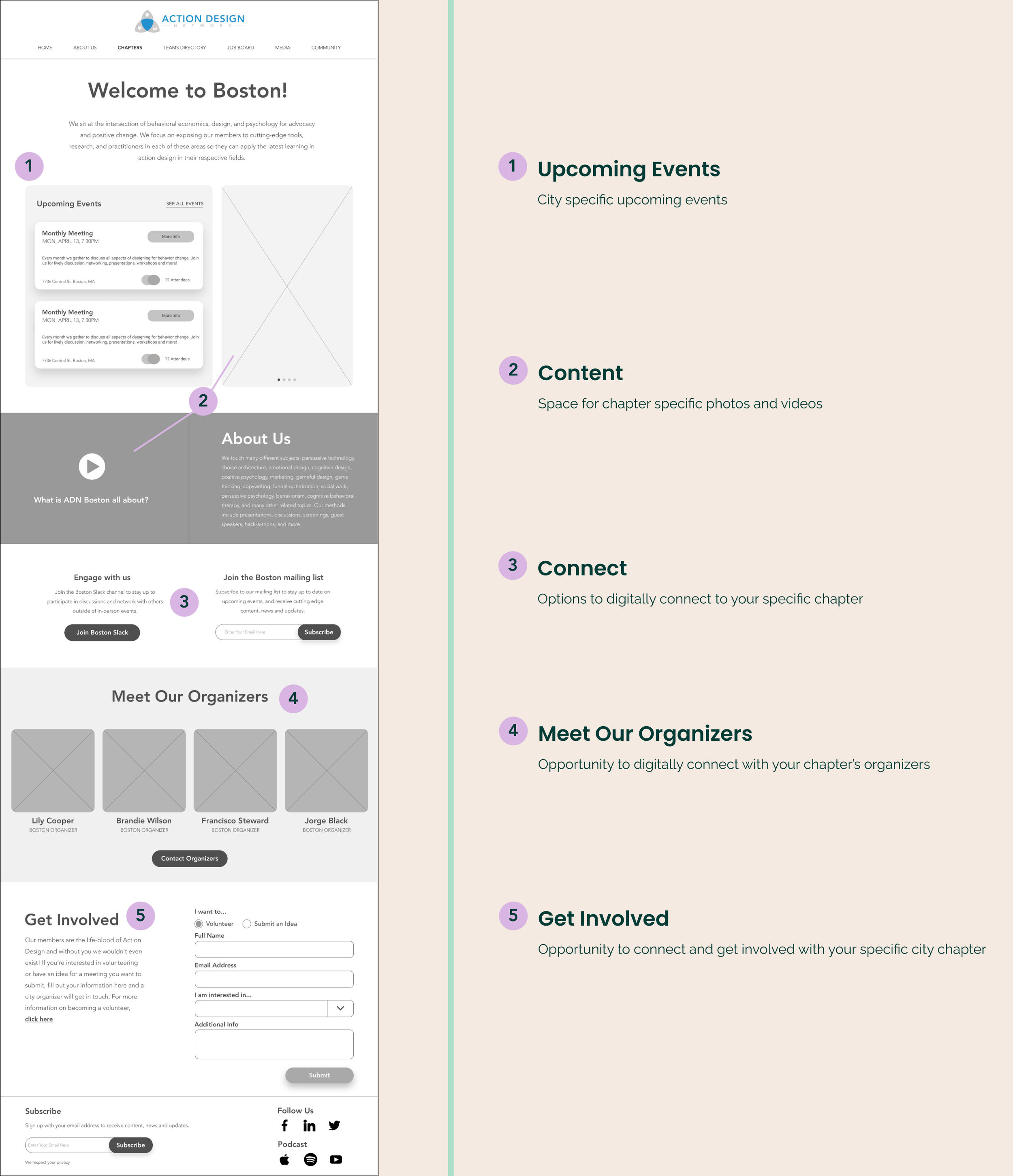
City Page and Community
Outside of the initial restructuring asked of us, our team also wanted to look at ways that we could incorporate the sense of community so many members appreciate from the in-person meetings. We knew the stakeholders were interested in making a shift towards a more digital approach and with Covid-19 starting to shut things down at the time, it felt like an urgent need more than ever.
While brainstorming ways to bring a sense of community into the digital space I conducted research into other organizations that included in-person networking events. I found that many of them included pages for each specific chapter to showcase their own information. I decided this could be a good way to keep users engaged on the site vs taking them straight to the Meetup.com page and would also be a good opportunity for chapters to directly connect with their members. I brought this idea to the team and from there we decided to design a few different ways to present this.
We also took a look at a number of different ways people interact with each other online. We decided to create a mock forum, include buttons to join Action Design Network Slack channels as well as various other ways to connect with chapter organizers throughout. We hoped by adding in this variety of connection points we could get a sense of which ones users would prefer to interact with.
Concept Testing
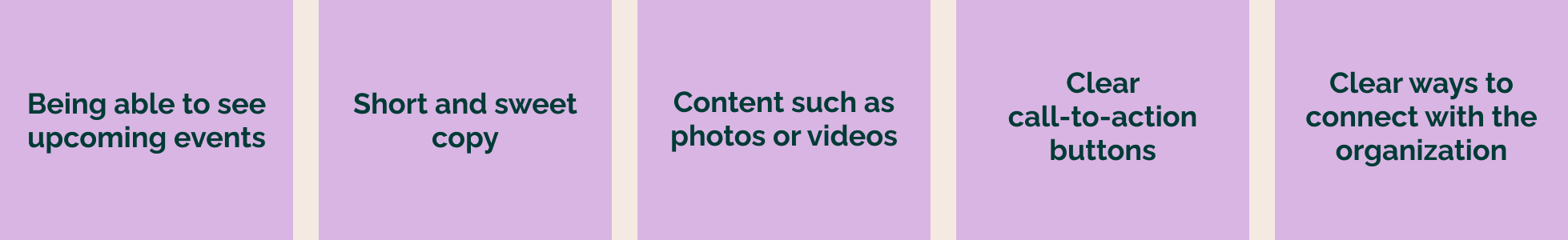
We fleshed out these ideas and took them into concept testing. We tested both new users as well as current members of Action Design Network. Testing revealed that users valued being able to see upcoming events (especially if these events could be catered to their location specifically), short and sweet copy, content such as photos or videos, clear call-to-action buttons, as well as clear ways to connect with the organization.
Bringing It All Together
We presented our concept testing findings to the client and discussed what we felt was important to take into a converged final design. Throughout the entire process our client was extremely agreeable and receptive to the ideas we brought to the table. We were reminded that Action Design Network is a non-profit, so the feasibility of some aspects were questionable due to time and financial constraints, but they were interested in any findings and research we could pass on to them. We made it clear that we could not design out a full community platform for their users, but were interested in gathering as much information as possible on users' view of a digital community to help Action Design Network make a more informed decision moving forward. We agreed that the designs created would showcase a future-state for Action Design Network to move towards as time and funding became available.
After aligning with the client, our team took some time to pull out pieces from each concept that were positively received during concept testing. From there we solidified a design guide and began merging these pieces together.
Moving Forward
We conducted usability testing, gaining feedback from both new and experienced users. We found that overall, users liked the designs and felt the new site was easy to navigate, but some users did run into confusion with terminology. Much of the copy used within our designs was provided to us by the client, but we found that many of our testers had trouble understanding some of the more technical behavioral science terms.
Within our usability testing, we also included more concept testing to gain further insights into what users were looking for from an online community. Testing revealed that users appreciate the idea of an online community, but it was unclear what type of online community they would prefer most.
Action Design Network came to us looking for a home page restructuring, but during this process we uncovered that users were also looking for a sense of community online and this need could not be ignored. In the end, both users and our stakeholders were happy with the restructured site. We were happy to also present the client with some insights into what their users are looking for in the ever changing landscape of digital socializing we are dealing with today.