FLTRD
This was an academic project where we were given the opportunity to choose any problem space we wanted to explore but had to end in the creation of a mobile app. A member of my team was working as a barista at the time and expressed she had noticed a steep learning curve into the complex world of artisanal coffee. She noticed a gap between not only herself and the other, more experienced, baristas, but also with customers who were looking to transition beyond their local Starbucks.
This was my first ever UX design project and provided a good base to understand that the design process may look linear, but rarely ever is. We frequently came up with new design iterations, and in some cases, completely started over based on user feedback. The name of our app is a good example of this. Our app began as “Counter Culture.” But, as one user test participant colorfully pointed out, “Counter Culture” is a popular roaster, and using that name would be confusing to expert users. Thus, we came up with Fltrd, which is actually more relevant to our app’s function.
Fltrd is a high-end mobile application providing coffee drinkers the ability to easily find, explore and purchase artisan coffee based on personalized coffee recommendations.
INITIAL RESEARCH
User Interviews
We took advantage of our team member’s barista environment and interviewed her managers, co-workers, and regular customers. These initial user interviews helped us uncover how people shop for their coffee, what they look for when shopping, as well as frustrations and barriers in the artisanal coffee world. We also inquired into features they would be interested in if there was an app to help bridge the gap to artisanal coffee.

Exploratory Research
The team dove into exploratory research to learn as much about coffee as we could. We were introduced to the idea that all coffees fall into three different categories that represent three different waves or movements of coffee. The first wave is seen as lower quality and is known as commodity coffee. It began when coffee became a staple in kitchens all around. Folgers and Maxwell are commonly referred to when talking about first wave coffees. The second wave came with big names, such as, Starbucks and Peet’s introducing the idea of choosing coffee based on origin and roasting styles and emphasizing the cafe experience. Finally, third-wave coffee focuses on specialty coffee. Third-wave coffee drinkers enjoy the coffee beans themselves, not just the cafe experience. After comparing notes with our user interviews, we had a good idea that third-wave coffee drinkers or users looking to transition into a third-wave coffee drinker, were most likely our target users.
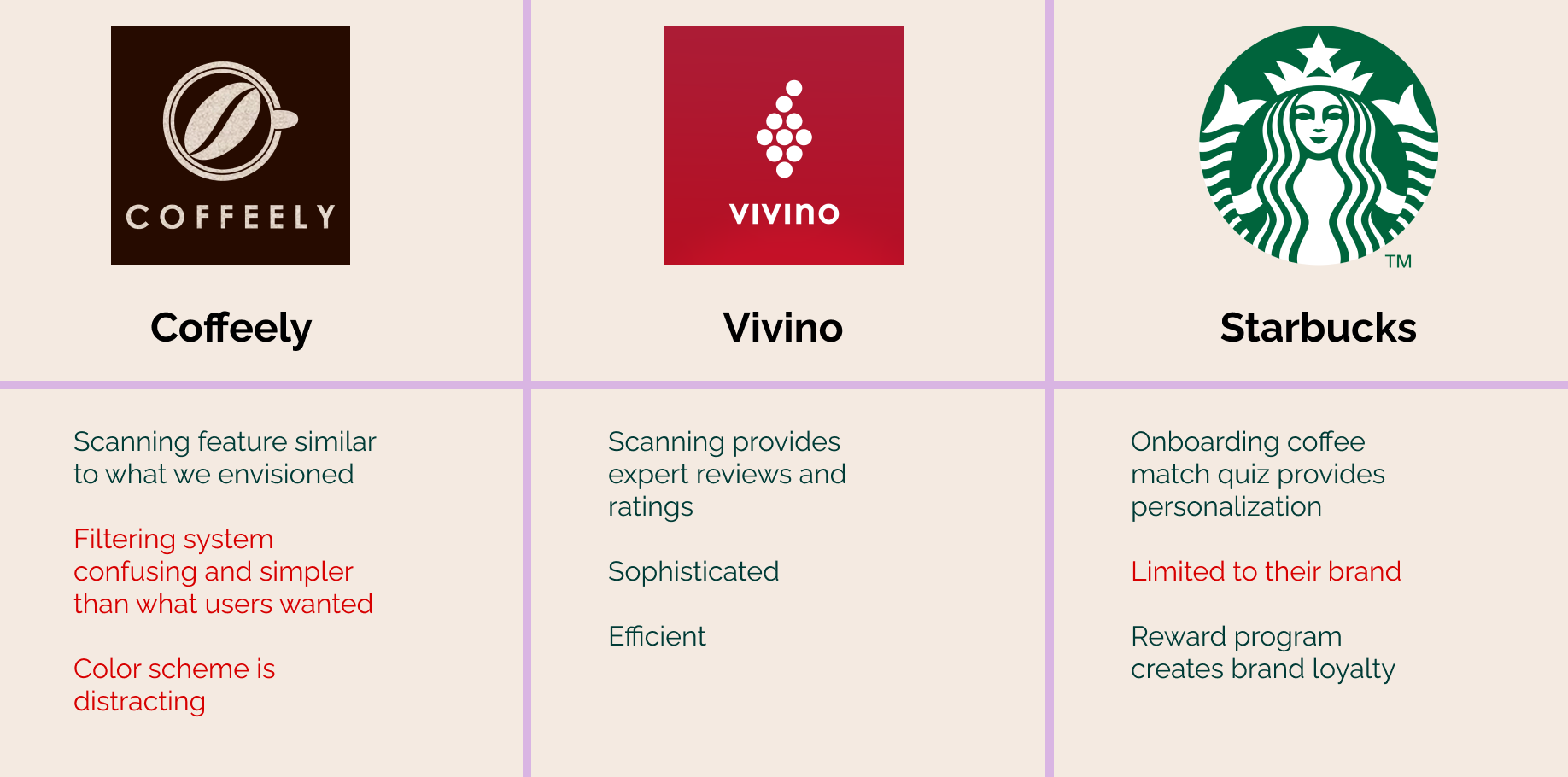
Competitive Analysis
We took a look at some direct and indirect competitors to get an idea of what was already out there. At this point we had already started solutioning, which with what I know now, is something I would try to steer us away from. Early on we decided we thought it would be cool to provide a scan feature for users to learn more information and find similar roasts to scanned coffees. This idea was inspired by the app Vivino which does exactly this, but for wine. Further research led us to Coffeely, who was trying to do this for coffee but wasn’t quite hitting the mark. Starbucks is such a big name in the coffee world that we knew we needed to take a look at their app as well.
Synthesizing Our Research
User Pain Points + Need Statements
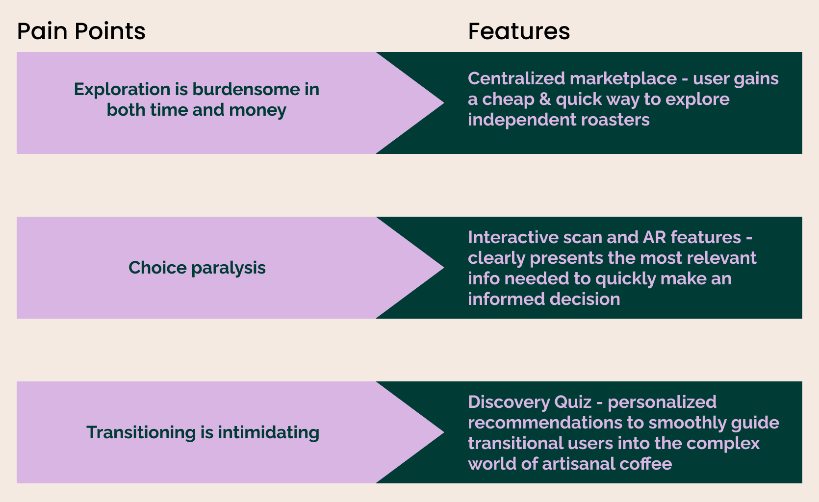
We gathered all our research and were able to group together a few user pain points we felt defined our problem space and that we could tackle moving forward.
Due to time constraints, we prioritized our list down to 3 key features that aligned with the most common pain points uncovered during initial user research. With easy access to our interviewees through our barista teammate, we continually checked in with our ideas to make sure we were staying in line with user needs.
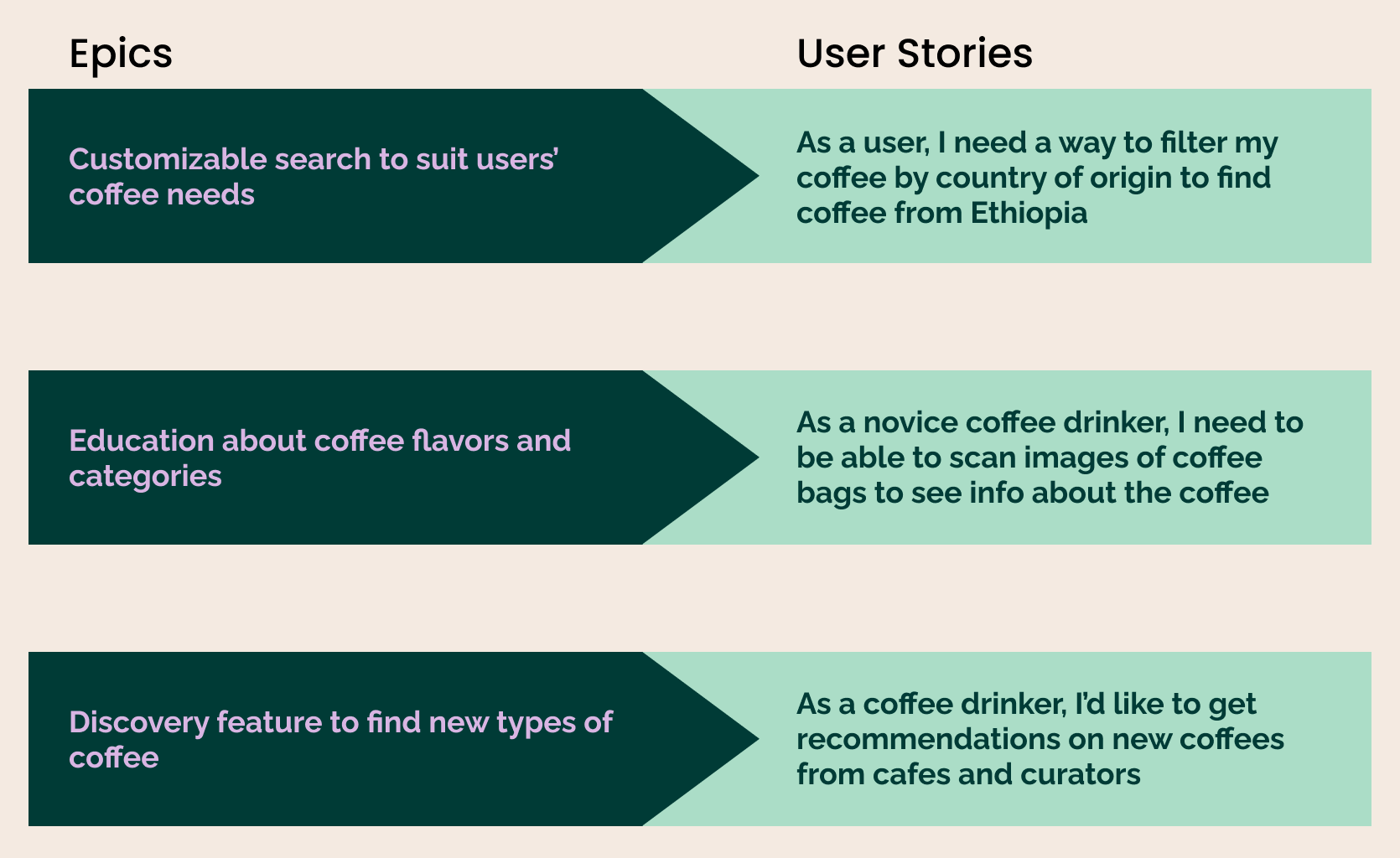
We took these features and generated user epics and stories to help us maintain our focus throughout designing. We used epics to identify major themes, and user stories to hone in on the actual tasks our users want to perform
Design Decisions
Sketches, Wireframes, Prototype
Now it was time to lay the groundwork for Fltrd’s interface design. First, we sketched our ideas on paper. Once comfortable with our screen concepts, we turned our sketches into low-fidelity wireframes and then high-fidelity wireframes using Sketch. From there, we bounced between sketches, wireframes and prototypes as our ideas developed and evolved.

UI Decisions
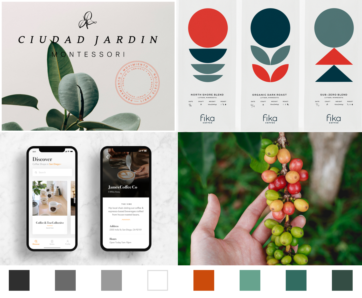
As a high-end application, we wanted Fltrd to reflect a sleek and sophisticated feel. To echo this with our color palette, we went back to the source; being that coffee originates from a cherry bean, we thought it would be a clever reference that coffee lovers would appreciate.
Final Designs
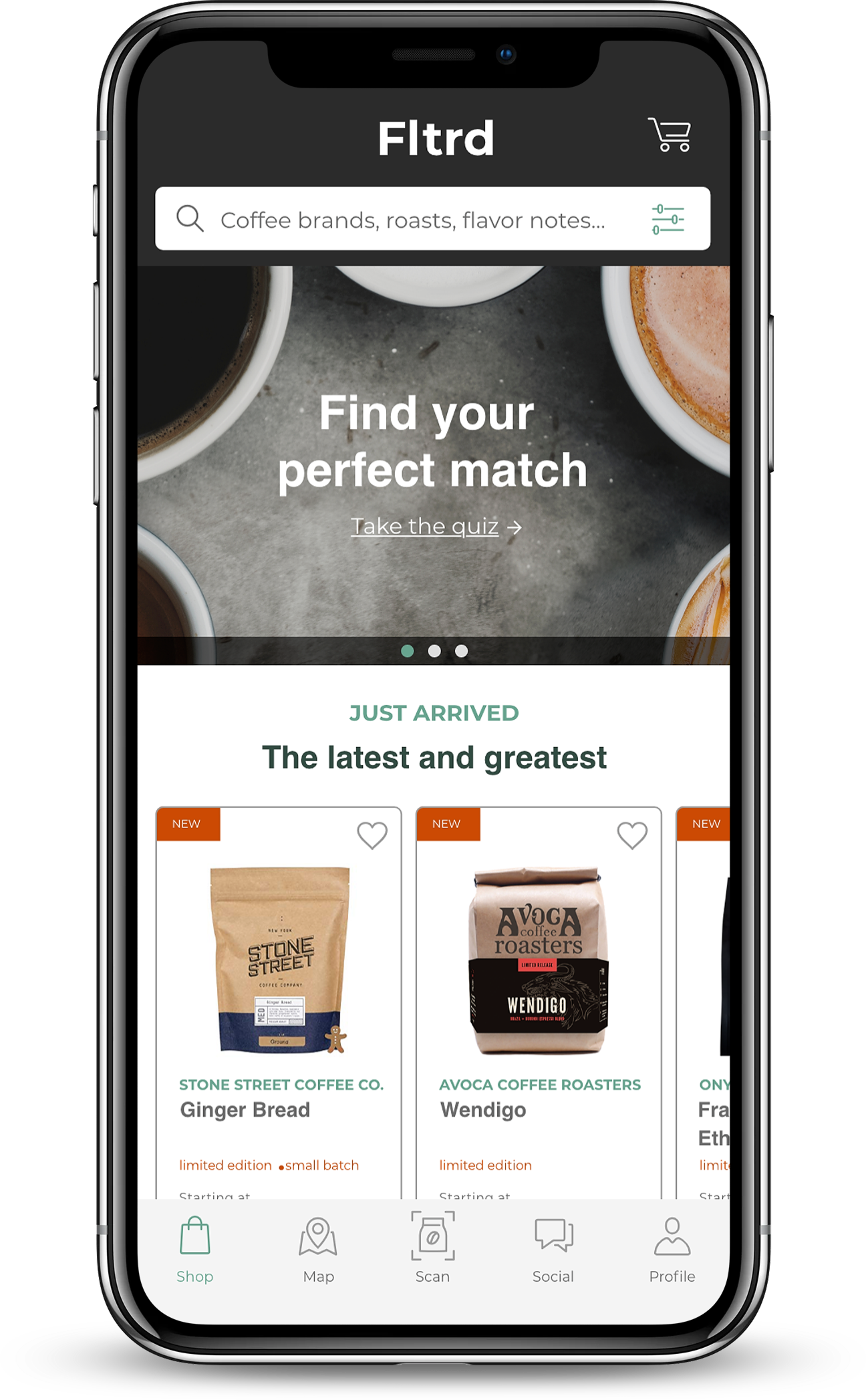
Homepage
Find Your Perfect Match Quiz - for new coffee drinkers to learn what types of coffee they like and receive personalized recommendations moving forward
Features newly available roasts
Search bar for searches with intention
Coffee Profile Page
Includes flavor, origin, and roast
Option to “heart” to save to favorites
Choose a size and whether you want the beans whole or ground
Add to cart - then have the option to continue shopping or proceed to checkout
Reviews - verified curator label to know who’s an expert
Keywords - clickable to explore similar roasts
Similar recommendations shown at the bottom
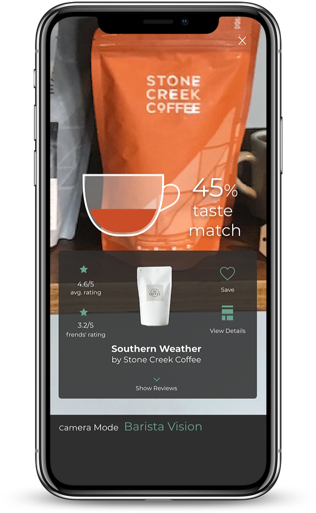
Scan
Scan coffee bags
Shows taste match percentage and the average rating
From here can see reviews, details and save to favorites
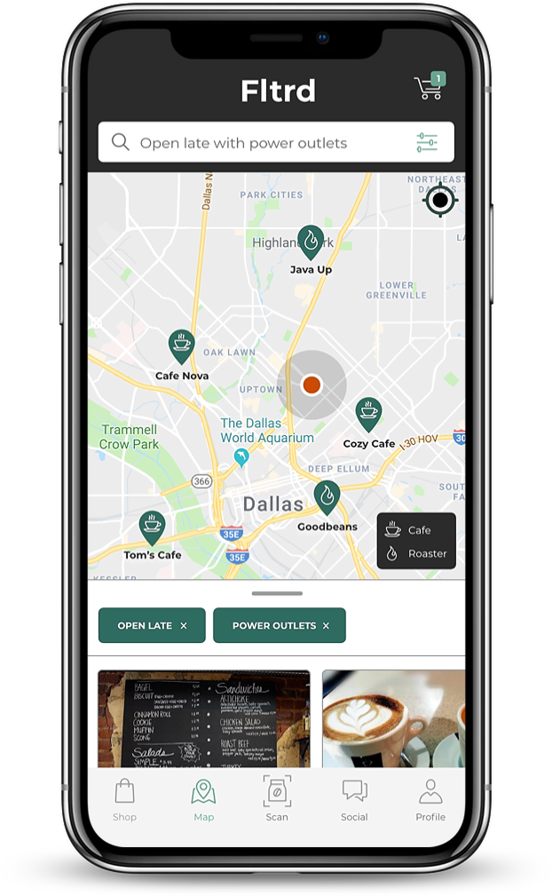
Map
See local roasters and cafes near you
Includes tags for information such as open late or whether they have a good number of available power outlets for a more curated search experience
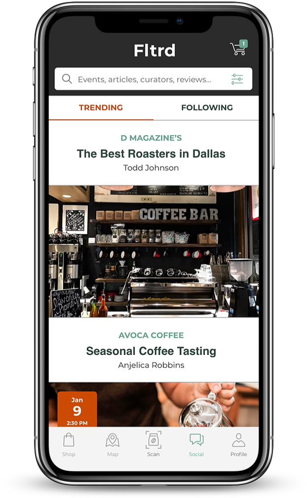
Social
Provides a space for upcoming events, local coffee news and featured reviews

Testing
We set up shop one day in Magnolia’s Cafe and conducted some guerilla usability testing with our prototype. We were able to gather a mix of both casual and experienced coffee drinkers. We gathered feedback on their initial impressions and expectations, while also taking note of their success rate of task scenarios.
We found that overall users were pleased with the app and thought that it would be something they could see themselves using. However, a few buttons throughout did not appear clickable to users, some terminology was unclear, and an issue that almost all of our users ran into was the AR wand icon. People associated the wand with photo editing and were unable to determine what it’s function would be within our app. After organizing our results we rated each issue on level of severity to decide what would need immediate attention.
Among the main takeaways, I learned that constant iteration is a necessary and unavoidable part of the process, collaboration is a skill, “I like, I like, I wonder” is extremely useful in expressing opinions, and finally, we are not the user!